Shifting Left: Standardizing Accessibility in Design
From reactive fixes to proactive specs, scaling accessibility through a comprehensive design-led training program.
The Challenge
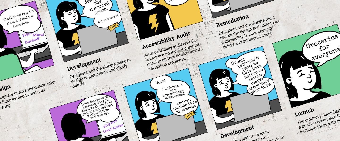
Kroger needed to scale accessibility beyond its two-person specialist team. Although the organization aimed to "shift left," designers lacked the technical knowledge and a standardized framework to communicate requirements to developers. This gap created a bottleneck, leaving accessibility as a reactive fix rather than a proactive design requirement.
The Solution
We built a comprehensive training and tooling ecosystem to embed accessibility into the standard design workflow.
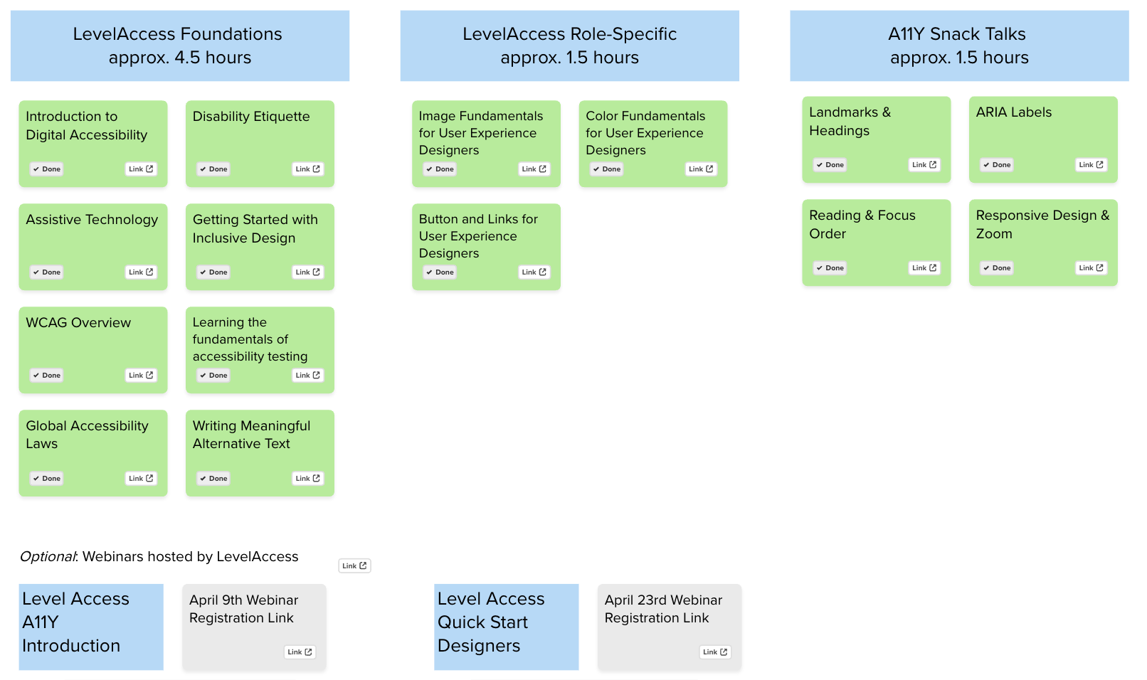
- Foundational Training: Partnered with the Accessibility (a11y) team to deploy prerequisite courses through Level Access.
- Annotation Toolkit: Designed an official Figma library and documentation guide to standardize handoffs.
- Hands-on Workshops: Led interactive training for 15 designers to bridge the gap between theory and execution.
- Continuous Mentorship: Launched weekly office hours to troubleshoot real-world applications.
My Role
I transformed an individual workflow into an enterprise-wide standard. Leadership tapped me to scale my personal accessibility process across the organization. I collaborated with Rose Peruski and Bridget Hutchison (a11y team) to align our design toolkit with corporate goals, moving beyond "delivering a tool" to cultivating a community of practice.
Discover
Auditing the Landscape
I began by auditing existing accessibility annotation kits and desk research to see how industry leaders handled handoffs. Rather than reinventing the wheel, we selected a base Figma kit and customized it to fit Kroger’s specific needs.

The "Aha" Moment
User interviews with designers revealed a critical insight: annotations are useless without foundational knowledge. I discovered that designers who attempted annotations without training often provided incorrect requirements. Developers would then follow these "specs," inadvertently building inaccessible experiences. This realization expanded our scope from a simple toolkit to a mandatory training program.
Define
Curating the Curriculum
I worked with the a11y team to audit the Level Access catalog. We curated a "lean" curriculum, selecting only the most high-impact design courses, to ensure designers could balance training with their active project loads.
Develop
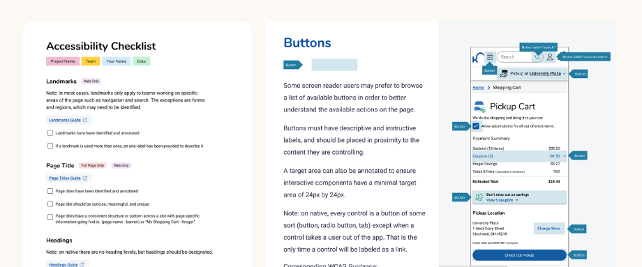
The Annotation Guide
I translated a technical checklist into a designer-friendly Figma resource. To prevent "compliance fatigue," the guide focused on the most critical WCAG success criteria first. The library included:
- The "Why": A business and ethical case for accessibility.
- The Guide: Clear definitions and visual examples of what to annotate.
- Interactive Checklist: A drag-and-drop tool for active files.
- Platform Examples: Full-page specs for Web, iOS, and Android.
The Pilot Program
We tested the curriculum with a pilot group of four designers. After completing the training and two workshops, we held a retrospective. The feedback was clear:
- Pros: Loved the hands-on collaboration and Kroger-specific examples.
- Cons: Content felt rushed; some struggled to bridge the gap between abstract theory and developer handoff.

Deliver
Iterating for Impact
Based on pilot feedback, I overhauled the program:
- Contextualized Content: Swapped all generic examples for real Kroger interfaces to make the training feel relevant.
- Streamlined Workshops: Cut non-essential theory to allow more time for hands-on "live" annotating.
- The "Collaboration" Layer: Added a new section specifically on developer communication—teaching designers how to speak the language of code.
Office Hours & Scalability
As adoption grew, our general accessibility office hours became overwhelmed. I launched Dedicated a11y Annotation Office Hours specifically for designers. This provided a safe space for peer review and ensured that the a11y specialist team could remain focused on high-level compliance.
Results & Impact
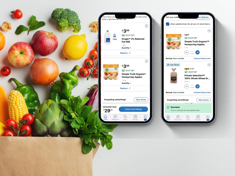
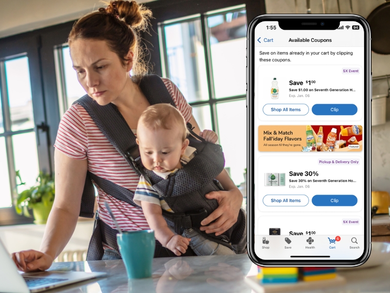
The true value of the annotation training became evident during Kroger’s App Redesign. Because the design team had already established a baseline understanding of accessibility, we avoided the typical friction of retrofitting accessibility into a new product.
- Accelerated Design Phase: Designers utilized the standardized annotation toolkit from day one, ensuring that inclusive patterns were baked into the redesign.
- Shifting Left: By moving accessibility requirements into the design phase, the team identified and resolved potential barriers before a single line of code was written, preventing costly remediation during the redesign.
- Seamless Cross-Functional Alignment: The shared language established between designers and the a11y team during the workshops allowed for faster sign-offs on new App redesign components.
- Scalable Knowledge: The groundwork laid by the initial training program ensured that the massive scope of the App redesign was handled by accessibility-literate designers, reducing the oversight burden on the two-person a11y specialist team.
Reflections & Lessons Learned
If I were to do this again, I would prioritize a "train the trainer" model. While the workshops were successful, they relied heavily on my manual facilitation. Developing a program where others are trained to lead the sessions would have made it easier to scale the curriculum across the entire design organization more rapidly.
This project was never just about a Figma library; it was about technical readiness. By standardizing our process early, we ensured that Kroger's most significant app update was accessible by default. It proved that a well-trained design team is the best defense against digital exclusion.