Kroger: Recapturing Revenue in the Cart
How a smart replacement feature drove a 12% increase in AOV by transforming out-of-stock friction into seamless shopping opportunities.
The Challenge
Unexpected unavailable items turn the convenience of online shopping into a frustrating dead-end. When items sell out after being added to a cart, customers face a difficult choice: backtrack to manually find replacements or abandon their order entirely. When these items fall out of the cart, conversion rates plummet and Average Order Value (AOV) suffers.
The Solution
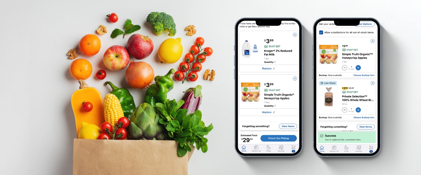
To mitigate checkout friction, I designed a "Similar Items" feature that proactively suggests relevant alternatives directly within the cart. By allowing users to replace unavailable items with a simple flow in Cart, we transform a dead-end experience into a continuous shopping flow, reducing the likelihood of total order abandonment.
My Role
As the Design Lead, I spearheaded the end-to-end project, transitioning the project from initial discovery and problem framing through to high-fidelity execution. I worked in close partnership with my Product Manager Angelina Mei to align our strategy with business goals. I collaborated deeply with my research partner, Kenny McMahon, to validate our hypotheses through user testing, while maintaining a constant feedback loop with the Engineering team to ensure our proposed solutions were technically viable and integrated seamlessly.
Discover
Understanding the Target User
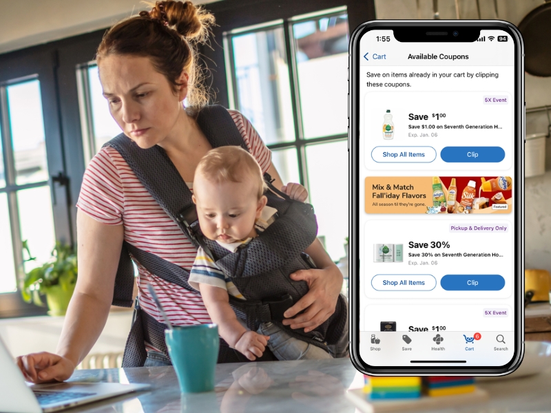
We focused our efforts on the "Lighten the Load" customer segment. These shoppers value efficiency above all else; they view grocery shopping as a mission to "check a task off the list."
- The Risk: "Lighten the Load" shoppers are more likely to switch retailers to find the products they need and complete their mission.
- The Goal: We knew the solution had to be convenient and make it easy to get the job done.

Audit the Current Flow
I mapped the existing user journey to pinpoint why items became unavailable in the cart and during checkout. Initially, we aimed to prevent unavailable items from entering the cart at all. However, because real-time inventory fluctuations can occur after an item is added, our goal shifted from prevention to frictionless recovery.
Key Pain Points Identified:
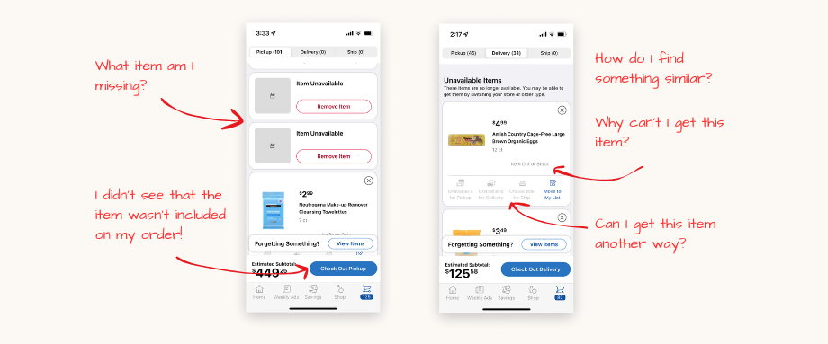
- Lack of Transparency: No clear communication explained why a product was suddenly unavailable.
- The "Surprise" Factor: Users frequently missed the fact that items had become unavailable in their cart, leading to frustration when products were missing from their final delivery.
- The Dead End: There was no intuitive path to find a replacement, forcing users to restart their search from scratch.
Desk Research
I synthesized industry best practices from the Baymard Institute, internal studies, and existing data to ground our strategy in established psychological principles:
- Loss Aversion Bias: According to this principle, the negative emotion a customer feels from losing a promised item is twice as strong as the positive emotion of gaining it. Transparency is key; providing more information gives customers a greater sense of perceived control.
- The Convenience Gap: Online shopping is fundamentally a service of convenience. Out-of-stock items immediately erode that value proposition and create friction.
- Promoting Alternatives: High-performing e-commerce sites prominently suggest alternatives before checkout. Ensuring these suggestions are highly relevant to the original intent is critical for maintaining the user’s mission.
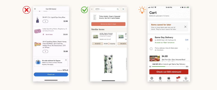
Competitive Benchmarking
My Product Manager and I conducted a comparative analysis to see how market leaders handle inventory friction:
- Walmart: Suffered from similar "dead-end" pain points, offering no clear recovery path for the user.
- Thrive Market: Set the gold standard by promoting relevant alternatives (aligning with previous desk research) and offering "Back in Stock" notifications to maintain engagement.
- Target: Offers a unique solution by automatically saving unavailable items for a later purchase. While interesting, we noted this may not suit the immediate needs of grocery shoppers.
Define
The Design Compass: Defining the Shopper's Mission
To guide the design phase, I synthesized our research into three core user needs. These statements served as our benchmarks for success:
- Fulfillment: "I need a way to complete my entire list in one session so I don't have to waste time re-shopping or switching to a competitor."
- Clarity: "I need to understand why an item is unavailable so I can make an informed decision on what to do next."
- Efficiency: "I need highly relevant suggestions surfaced before checkout so I can finalize my order and get on with my life."

Hypothesis Refinement
We synthesized our goals into a final North Star hypothesis:
"We believe that by providing 'Lighten the Load' customers with a clear pathway to replace low-stock or out-of-stock items before they enter the checkout flow, we will reduce frustration, save them time, and significantly prevent cart abandonment."
Develop
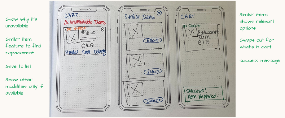
Ideation
To transition from problem definition to solutioning, I led a collaborative ideation phase focused on technical feasibility and user impact.
- Rapid Sketching: I initiated the process with individual sketching sessions to explore a wide range of UI treatments for "similar item" prompts and cart notifications.
- User Story Mapping: I facilitated a cross-functional workshop to map these ideas into a comprehensive user story map. By visualizing the entire replacement journey, we were able to align on the user's "must-haves" versus "nice-to-haves."
Usability Testing
To measure the impact of the proposed solution, I created an unmoderated, advanced usability study with 20 participants to compare the existing "unavailable" experience against our new design. We focused on task success rates and user satisfaction.
Key Research Findings
The research confirmed that our solution transformed a standard industry pain point into a competitive advantage.
- Behavioral Shift: Participants were accustomed to "doing the work themselves" to find replacements, the replacement suggestions significantly reduced cognitive load.
- Time Savings: Users reported the new flow felt more intuitive and "friendly," effectively preventing the frustration that typically leads to abandonment.
- Competitive Edge: Several participants noted that this setup outperformed their current grocery apps, specifically mentioning that it felt "smarter" than the competition.
- Desirability: While the core flow was a success, the data indicated a need for further research into secondary features like switching delivery modalities and "Save to List" functionality.
"I really like the options. This is set up better than my own store." – Research Participant
Iteration: Refining the Experience
Following the usability study, I synthesized the data into a prioritized roadmap. I iterated on the designs to balance user needs with technical readiness, categorizing our next steps into four pillars:
- High-Confidence Wins (Moving to A/B Testing)
- Similar Item Suggestions: This was the standout success. With minor UI polishing to improve visual hierarchy, this feature is ready for A/B testing to measure its impact on conversion.
- Modality Switching: While qualitative feedback was positive, we will launch an A/B test to validate the true desirability and business impact of allowing users to switch fulfillment methods mid-flow.
- Refining Core UX
- Discoverability of Unavailable Items: Despite improvements, findability remains a challenge for some users. I am exploring high-contrast UI updates and placement options for a targeted follow-up study to ensure no user misses these critical alerts.
- Simplified Deletion: We maintained the native "X" affordance for item removal of items on mobile. However, I flagged a need for additional research to determine if web users require a more explicit "Remove" interaction to reduce friction.
- Strategic "Holds"
- Save to List: Research suggests that while this is a requested feature, we need a deeper understanding of user curation behavior before building. We are pausing this to avoid feature bloat and ensure the final implementation provides genuine value.
Deliver
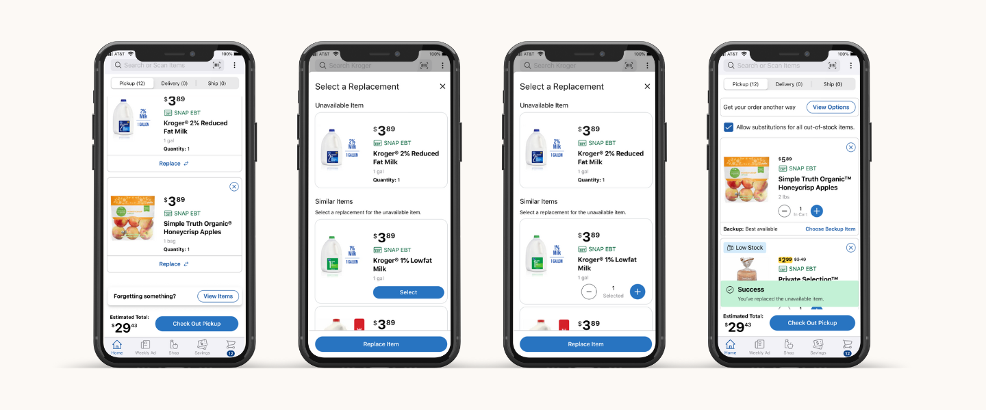
High-Fidelity Design
Using Figma, I developed a comprehensive suite of high-fidelity designs tailored for iOS, Android, and Web (Mobile/Desktop). By leveraging a platform-specific approach, I ensured the solution felt native to every device while maintaining a cohesive brand identity across the Kroger ecosystem.
Design Handoff & Technical Alignment
I worked in lockstep with Engineering and Product partners to move from static frames to a live product, focusing on three core areas:
- Comprehensive Documentation: I partnered with Product Management to translate designs into detailed functional requirements, this included mapping every edge case and user flows.
- Accessibility First: All handoff files included rigorous accessibility annotations. These served as a blueprint for Engineers and QA teams during development and "desk checks," ensuring the feature was inclusive for all shoppers.
- Engineering Syncs & "Desk Checks": To maintain high visual and functional fidelity, I held regular reviews with the development team. This allowed us to troubleshoot technical constraints in real-time without compromising the user experience.

Results & Impact
A/B Testing: Identifying the Winner
We tested two distinct variants designed to help users recover from inventory gaps. Through rigorous A/B testing, we discovered that users overwhelmingly preferred a streamlined replacement flow (Variant B), which focused exclusively on finding a similar item. This variant outperformed the alternative of moving items to other lists, leading to a 12% increase in AOV for customers who utilized the recommendations and a 2% lift in incremental cart adds directly from the cart space.
+2%
+12%
Reflections & Lessons Learned
While the UI was successful, we encountered limitations with the recommendation engine’s coverage. In some instances, the "science" behind the similarities failed to surface an alternative. In hindsight, I would have engaged the Personalization and Data Science teams earlier in the discovery phase to ensure our "Similar Item" logic was as robust as the design itself.
Long-Term Growth & Evolution
Since the initial launch, we have continuously iterated on the experience to bring our long-term roadmap to life. These enhancements have further stabilized the checkout funnel and improved the overall shopping experience.
Key Enhancements:
- Strategic Re-ordering: Moved unavailable items to the top of the cart, which drove even higher user engagement and faster recovery.
- Checkout Integration: Scaled the feature into the final checkout flow, leading to improved fill rates and a significant increase in fallout recovery.
- Simplified Cart Modality: Refined the "Add to Cart" interaction to create a cleaner, more intuitive mental model for the user.
- Standardized Bulk Adds: Streamlined the bulk-add functionality to ensure a consistent experience across all product categories.
- Future-Proofing: Initiated development on a "Save for Later" feature, providing a low-friction alternative for customers when a direct replacement isn't needed.