Kroger: Effortless Savings in the Cart
How streamlining coupon discovery drove $2.3M in incremental revenue and doubled user engagement.

The Challenge
Today’s grocery shoppers are more price-conscious than ever, yet they face a common friction point when finding savings on items they need. Many users find the process of hunting for coupons tedious and lack confidence that discounts have actually been applied to their final total.
The Solution
We introduced an Available Coupons feature that identifies relevant discounts for items already in the customer’s cart. This removes the manual effort of searching and provides immediate, visual confirmation of savings before checkout.
My Role
As the Design Lead, I spearheaded the end-to-end process from initial discovery through high-fidelity design. I worked in close partnership with my Product Manager and Engineering team to ensure the solution was both technically viable and aligned with our business goals.
Discover
Understanding the user
We used our existing data to understand how users are shopping and saving. We found that what we call the “shop first, save later” customers are the ones that could benefit most from easily finding savings. And while people are spending more time on our devices, the average mobile session is only 72 seconds. That means, we not only need to help users accomplish their goals in small snippets or micro-tasks, we also need to design for interruptions.
.png)
Audit the Current Flow
We mapped the end-to-end user journey to identify why customers were struggling with savings. The audit revealed that both Web and Native platforms suffered from a fragmented savings experience that forced users to choose between manual effort and missed discounts.
Key Friction Points
- The "Exit" Requirement: The journey was fragmented by forcing users to leave their cart and navigate to a separate Savings Center to find deals.
- Inaccessible Coupon Clipping: Although savings were indicated on product cards, the tags were non-interactive. This forced users to navigate to the Product Detail Page just to clip a single coupon, adding unnecessary friction to the saving process.
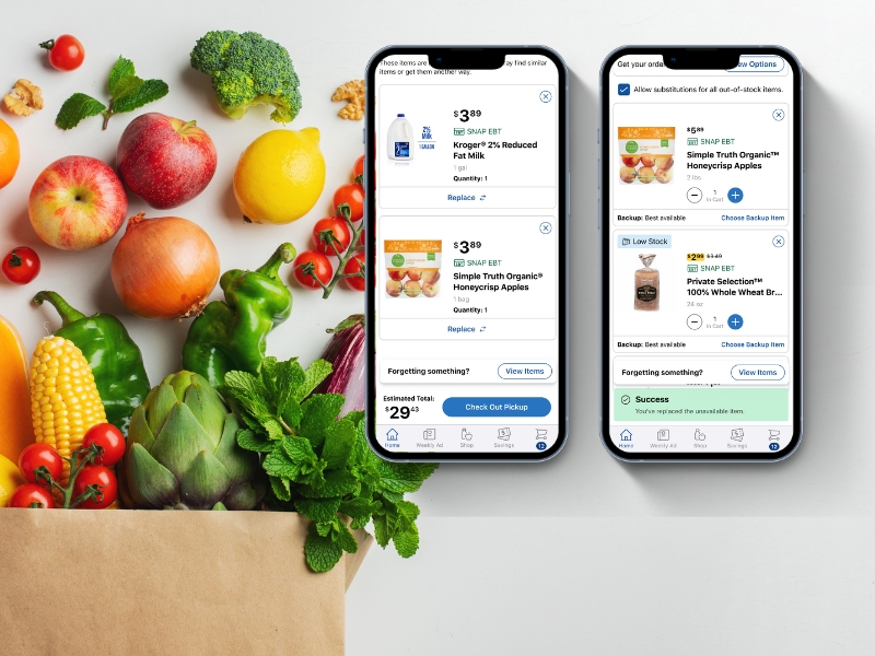
- Lack of Pricing Transparency: The absence of a detailed pricing summary in Cart, left users with no visibility into their final cost and decreased confidence in their total.
.png)
Competitive Benchmarking
I analyzed how direct competitors (Instacart, Walmart) and indirect competitors (Honey, Rakuten) handle savings. Several key themes emerged that informed our design strategy:
- Transparency as Trust: Clear, real-time feedback is essential for building user confidence and reducing price anxiety during checkout.
- Centralized Access: Top-performing products provide a single, dedicated location for all savings, eliminating the need for users to hunt across different pages.
- Contextual Relevancy: The most effective experiences prioritize savings that directly apply to the items already in the user's cart, helping them maximize value with minimal effort.
Subject Matter Expert Interviews
To bridge internal knowledge gaps regarding the technical and legal logic of our savings systems, I conducted interviews with key Subject Matter Experts. These sessions revealed a critical business requirement: per our current partnership contracts, coupons cannot be applied automatically. Customers must explicitly view and "clip" coupons to satisfy these agreements, which directly informed our design approach for the Savings Center.

Define
Persona Refinement
I focused our design efforts on the "Shop First, Save Later" persona. Unlike "Deal Hunters" who build their entire cart around available discounts, these customers prioritize efficiency. They value savings but are unwilling to sacrifice time to find them; they expect the store to reward their loyalty automatically.
Problem Refinement
Through research, I identified that the core problem wasn't just a lack of coupons, it was a Transparency Gap. This is the anxiety users feel when they can't verify if a discount was successfully applied. The challenge became twofold: making coupons discoverable and making the final savings undeniable.
How Might We (HMW) Statements
To guide our ideation phase, I framed our primary challenge as:
How might we ensure the "Shop First, Save Later" customer never misses a saving opportunity without adding friction to their checkout flow?
Develop
Ideation Workshops
I facilitated a "Crazy 8s" workshop with Product and Engineering to rapidly ideate solutions. After a round of dot-voting and feasibility reviews, we narrowed our focus to two core concepts:
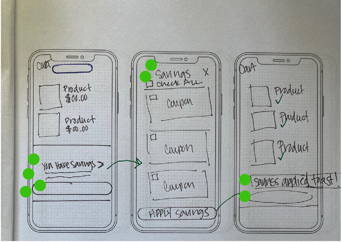
- Concept 1: One-Click Savings. A direct, in-cart action that provides immediate visual feedback.
- Concept 2: Embedded Savings Center. A lightweight drawer within the cart flow that allows users to apply all relevant coupons in a single click.
Usability Testing
I conducted unmoderated usability testing to validate these concepts. The feedback was overwhelmingly positive, with users immediately recognizing that the coupons were tailored to their specific cart items. Key takeaways included:
- Expectation of Persistence: Users expected that once a coupon was checked, the "work" was done and the state would be saved throughout the checkout.
- Clarity of Personalization: The contextual nature of the coupons (matching cart items) was highly intuitive.
- User Sentiment: One participant noted: “I like it. It’s very simple, intuitive, and easy to navigate.”
Deliver
High-Fidelity Design
Using Sketch, I developed high-fidelity designs for iOS, Android, and Web (Mobile/Desktop), focusing on a seamless "maximize savings" flow.
The User Journey:
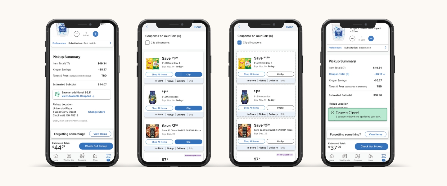
- Discovery: A prominent CTA in the cart highlights the specific savings amount available for the items already added.
- Personalization: Clicking the CTA opens a tailored list of coupons with a global "Clip All" checkbox for maximum efficiency.
- Confirmation: Upon returning to the cart, users receive a confirmation message, and applied discounts are clearly itemized in the pricing summary to close the "Transparency Gap."
Platform Evolution: From Modal to Drawer
During the Web design phase, we pivoted from a modal to a side drawer based on several critical UX and technical factors:
- Flow Hierarchy: Modals created a "modal-on-modal" conflict when users clicked coupon details, which felt clunky and presented significant accessibility hurdles.
- Visual Integrity: Standard coupon cards didn't scale well in a modal; they appeared stretched or awkwardly justified.
The side drawer perfectly accommodated the coupon card width and maintained cart context. User testing validated that this flow felt more natural and intuitive than a disruptive modal.
Results
To support our key metric of increasing savings per order, we launched the Coupon Clipping feature in Cart. The initiative has been a resounding success, consistently exceeding our performance targets with a 9.1% engagement rate, nearly double our initial 5% OKR. Even as engagement stabilized after launch, user behavior remained high, with customers applying an average of 1.7 additional coupons per transaction. This streamlined process drove $2.3M in incremental revenue and a sustained $3.04 lift in Average Order Value (AOV), proving that reducing friction directly correlates with increased basket value.
1.7
$2.3M
$3.04
Reflections & Lessons Learned
Navigating Technical & Legal Constraints Late in the development phase, we discovered a constraint involving our partner agreements and backend coupon logic that prevented the implementation of a "Single-Click Clip All" feature. While this was a pivot from our original vision, the project remained highly successful.
Stakeholder Feedback
"Just placing my delivery for the weekend and am so excited to use the recently launched coupons available feature. Found coupons there I wouldn't have otherwise even realized were available for my cart without going deep into the coupon details. So simple and easy to use LOVE and I know our customers will love it as well. Thanks to you and the team!"
-Dave Ostendarp, Senior Product Manager