Background
DecksDirect is a Minnesota-based online retailer of decking products whose mission is to Help People Build Better Decks. They have been rapidly growing since their inception in 2013 and are solving the problem of how to sell and ship large items across the country.
Problem
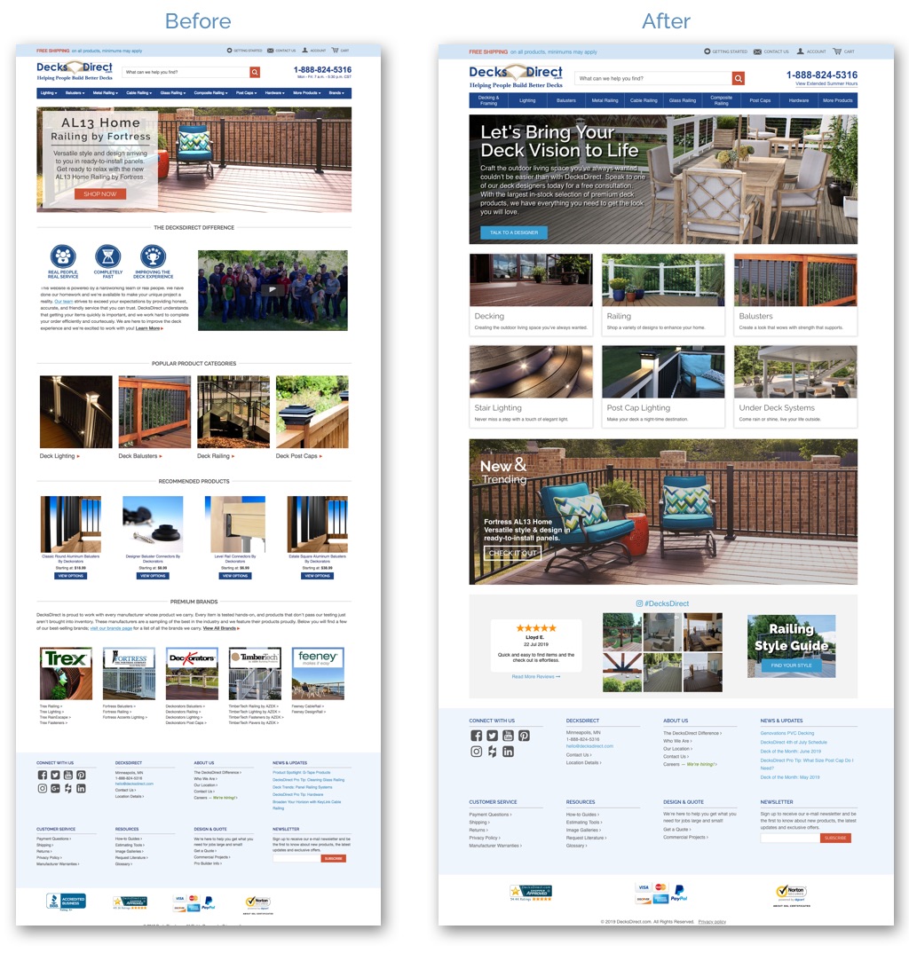
The home page received a lot of visits but had a high bounce rate. Content on the page was outdated. Users were confused about what DecksDirect did.
Solution
The solution was to simplify the homepage with the user in mind, highlighting the key journey starting points. We also included some social proof as research indicated this was important to the target market.
- My Role: Research, Sketches, Wireframes, Design, Assets, Style Guide, HTML Implementation.
- Tools: Sketch, Zeplin, Photoshop, HTML, CSS, Magento.
Design Process
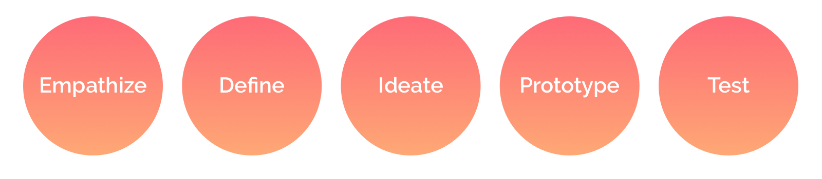
Empathize
Research
Since DecksDirect’s current home page had been in place for quite some time, I had a good amount of data to evaluate. I used Google Analytics as a starting point to see where people were coming from, what they were engaging with, and where they were going next. My key findings were:
-
Most users entered the home page from Google organic or paid search.
-
Other users were using it as a “reset” after browsing the site.
-
Popular product categories were the most engaged with elements.
-
The “About Us” and “Brands” sections were ignored.
-
The hero image received some engagement depending on the content.
Next, I conducted stakeholder interviews to determine what the goal of the project was. They wanted to use the homepage to highlight their “proven process”, which starts with the customer's vision followed by a call with a designer. This helped validate my thoughts on removing the “About Us” section to make room for something that was more customer-focused.
Lastly, I looked at user reviews and online chat data to determine if there were any insights that could be important to consider with this redesign. My key findings here was that people didn’t understand what the company was all about. They got the impression that the company was in the business of building decks, not selling them.
Define
Persona
I created a user persona to further empathize with the customer. I took a closer look at who this user is, their pain points, successes, and what their overall journey on the website. Some of this insight used on this persona I had gathered through other projects and user interviews.
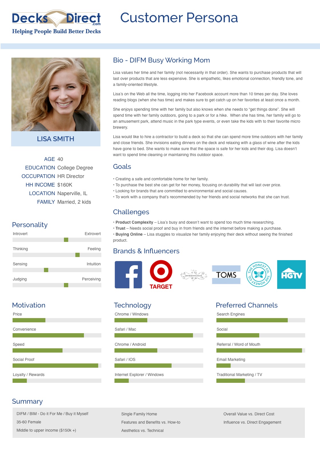
Summary
Do it For Me / Buy it Myself
Features and Benefits vs. How-to
Aesthetics vs. Technical
Overall Value vs. Direct Cost
Influence vs. Direct Engagement
Pain Points
-
The user struggles to visualize her family enjoying their deck without seeing the finished product.
-
The user doesn’t know decking brand names or some of the decking terminology.
-
The user is worried about making such a big purchase sight-unseen and from a company they haven’t heard of before.
Solution
I created a design that focuses on lifestyle images rather than product photos or copy. The product categories were moved to a more prominent location for easy access. The hero image and copy focus on the user and what they can expect when working with the company. I also curated social proof from multiple channels to build trust.
Ideate
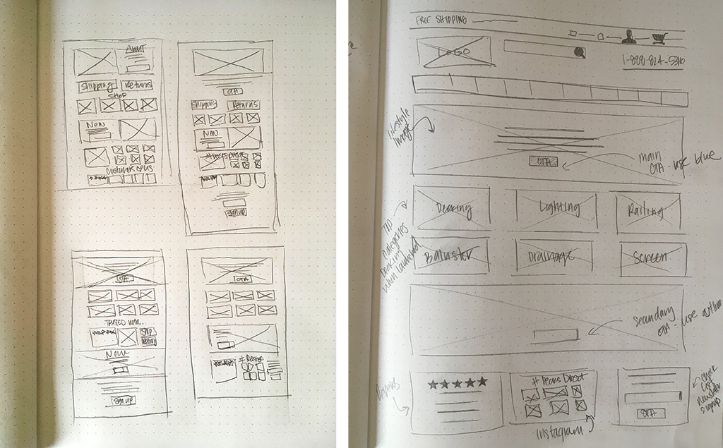
Sketches
I started with a list of key elements to include based on my research. Then I created four different sketches. As I discussed these with stakeholders and team members the design got simplified to keep the user focused.
Wireframes
I created both low and hi-fidelity wireframe for both desktop and mobile using Sketch. I also started working with a copywriter, discussing the different elements and how we might achieve our vision with the newer simplified copy on the page.
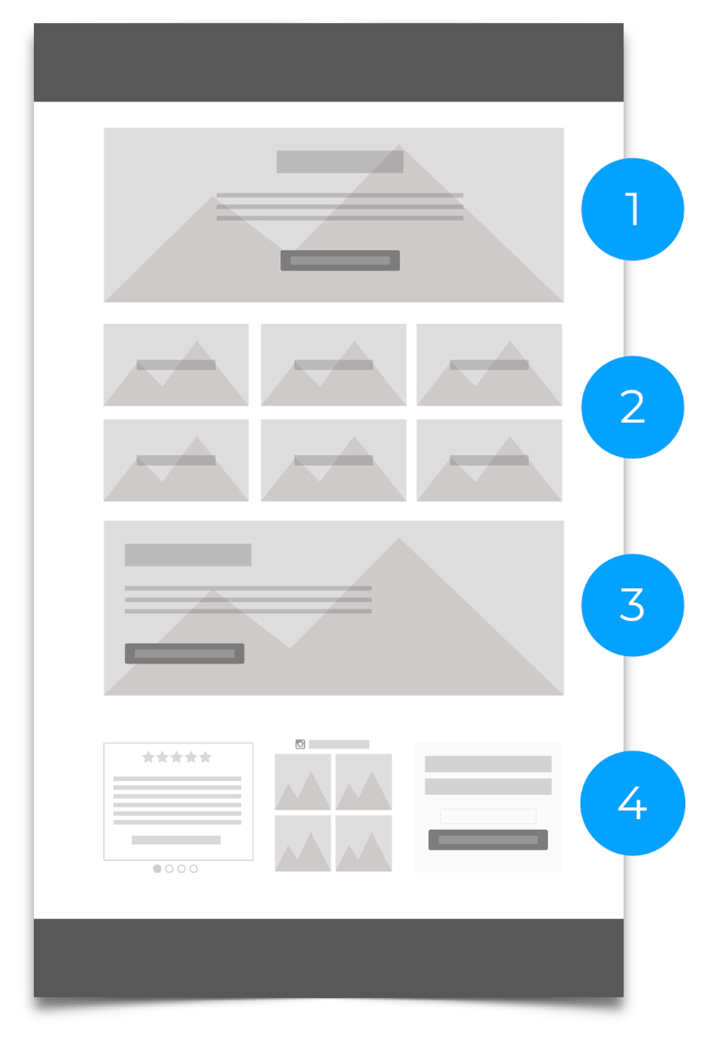
-
Proven Process
Use lifestyle image to help user envision their family on their new deck.
-
Copy speaks to what DecksDirect does.
Highlight the proven process, specifically "Talk to a Designer" CTA.
-
Product Categories
-
These were most engaged with.
-
Use data to inform categories to include.
-
- Featured Product
Another chance for lifestyle image.
Manufacturers pay for this spot.
-
Social Proof
-
Reviews to build trust.
-
Customer photos for inspiration / trust.
Opt-in for marketing funnel.
-
One hurdle I ran into was curating lifestyle images for the page. Finding one’s that fit the design concept proved difficult. Unfortunately, we did not have the resources to create lifestyle photos. We had to rely on what was available from manufacturers which were many times overused or bad quality. I worked with builders, manufacturers, and customers to come up with some updated lifestyle photos to use. Below is the hi-fidelity wireframe that was used to create the prototype.
Prototype
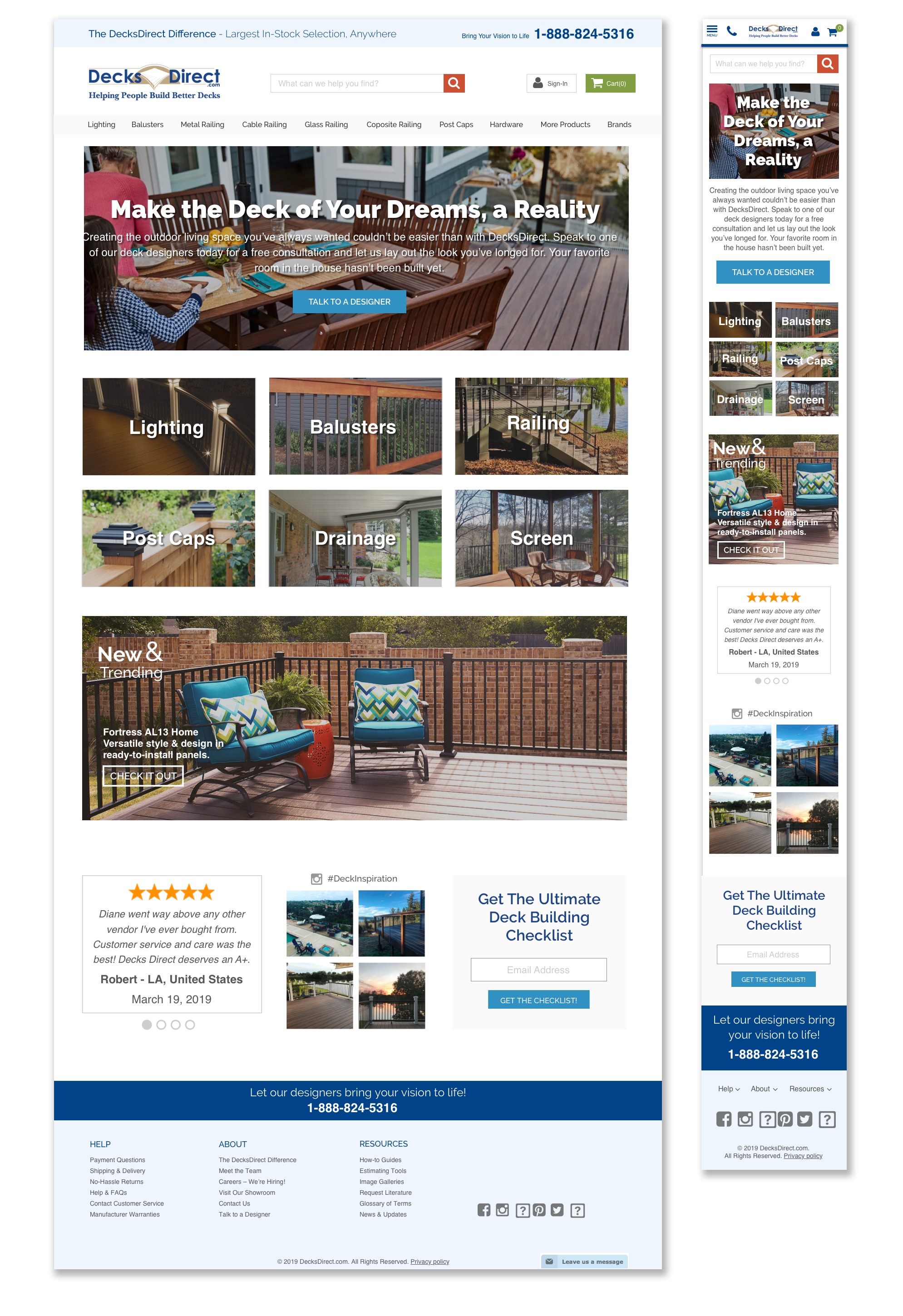
Visual Design
I worked with a developer to create an HTML prototype on the site. We decided to create a live prototype so we could test in real-time on the site. The current home page was left up for an A/B testing.
One hurdle we ran into was creating social proof widgets that matched the style on the site. These modules were generated from the individual channels and have limitations. I worked with the developer to come up with an MVP to get the prototype live while staying within the style and branding guidelines.
Assets Handoff
From Sketch, assets were exported into Zeplin for handoff to the developers. A style guide was then created to keep visual design consistency.
Test
User Testing
Once the page was on the site, we compared it to the current home page for bounce rate and conversions. Both of these metrics were improved, so we knew were on the right path. The team lead than did some online user testing with the new page. Most users liked the page and found what they needed.
Iterate
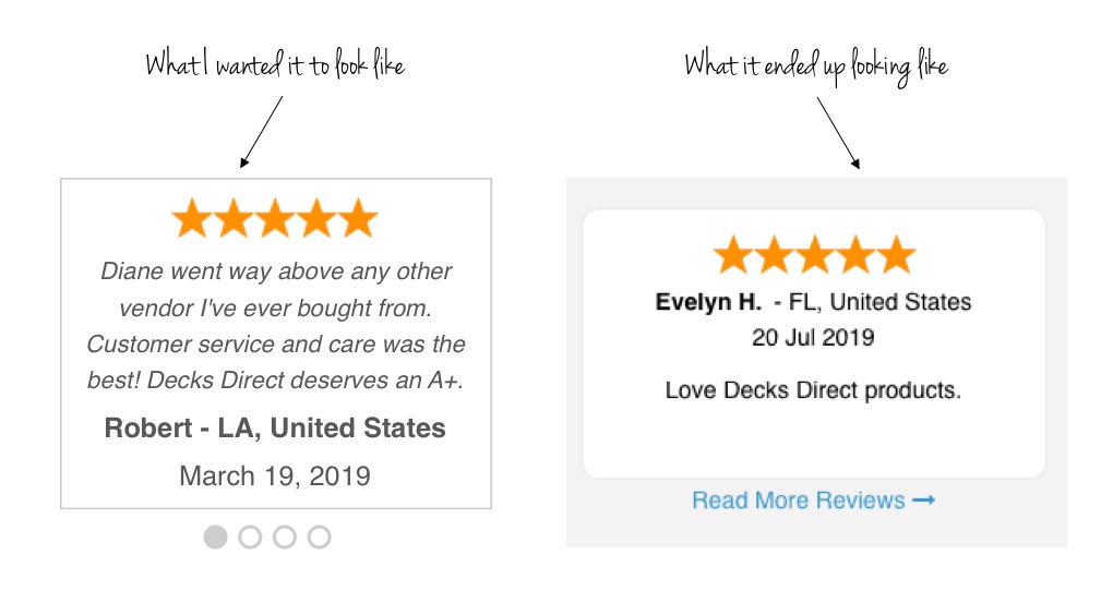
During user testing, we discovered that users had a hard time reading the text over the images. With the help of a developer, we made the following updates:
-
Changed the style of the hero image test to be easier to read.
-
Added a transparent gradient to the hero image to create more contrast between it and the image.
-
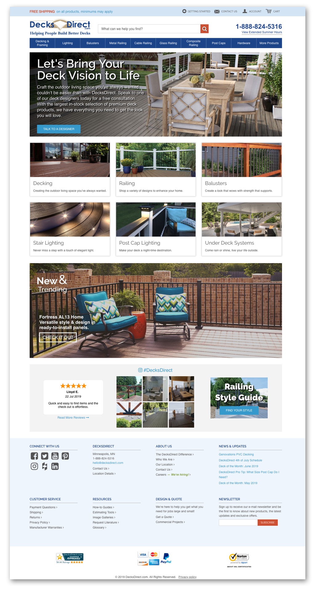
For the product categories, we move the copy from on top of the image to below the image.
Conclusion
Challenges
One of the biggest challenges in this project was implementing last-minute changes from stakeholders. We added more text over images and was seen as uneasy to read during user testing. I now know I should have taken the time to consider this during the design process when the changes were originally suggested.
Solution
In the end, we created a new homepage that focused on lifestyle and drove users to either work with a designer or start shopping. We created trust by highlighting social proof. We helped focus the user through a simplified design. The final product increased engagement while decreasing the bounce rate.
Reflections
Due to time and budget restraints, we were only able to test the new design with three users and do one iteration. The team at DecksDirect is continuing to test and iterate the design.
Acknowledgments
During this project I worked on user research and prototype design, informing the excellent work done by the companies developer and copywriter. Special thanks to Jamie Blackburn for painting a wonderful picture with her words and Jess Feigal for bringing the design to life.